New layout for Recently Updated Blogs
Today we have a slightly new layout for the Recently updated blogs page which makes the page easier to scan quickly to see what’s new.
I’ve noticed a couple of people recently saying that they frequently visit this page to see what’s been posted recently across what we used to call the blogosphere, and I’ve always had a nagging sense that the design wasn’t great for this purpose.
Up until now, this page – which displays a list of blogs ordered by those with the most recent posts first – has used the same layout as all the other lists of blogs on the site. The only difference was that the expandable sections were expanded by default, so that those recent blog posts could be seen.
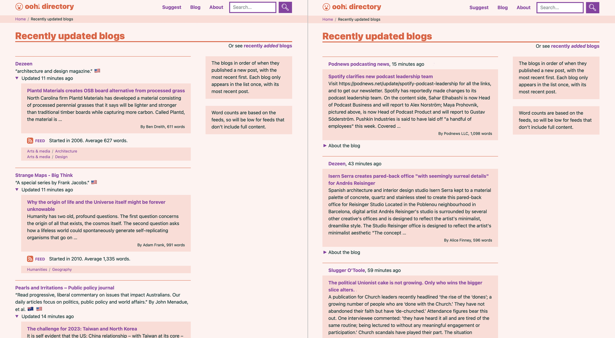
If you wanted to glance down it to see which blogs have updated, and what they’ve posted, there was too much else going on, as seen in the screenshot on the left. All the info about the blog – a description, its authors, a link to its feed, the categories it’s in, etc. – distracts from what’s important on this particlar page. Plus, the way each blog’s name was separated from the blog post title, and at a different level of indentation, made scanning down the page quite a bumpy ride.
So I’ve tweaked the design for this page only, focusing on those recent blog posts, as seen on the right. Now each blog displays only its name, when it was updated, and the blog post, with a longer preview of its text than before. The blog names and post titles are now closer and left-aligned for easier scanning. And all the blog’s other info is available behind the “About the blog” toggle control.
Hopefully it’s now a more useful page to see what’s happening out there in blogland.
It’s not perfect, because large, frequently-updated blogs tend to dominate the page at the moment, but I’m thinking about how best to deal with that. Any suggestions are, as ever welcome.
