Blog posting frequencies
One problem with the Recently updated blogs page is that it’s swamped by blogs that update several times a day.
And one thing that would be nice when browsing blogs in the directory is some indication of how how often a blog updates. Every day? Once in a blue moon? Both are fine but it’d be nice to know what to expect when adding a blog’s feed to your reader.
We now calculate the posting frequency of every blog which should help with both problems.
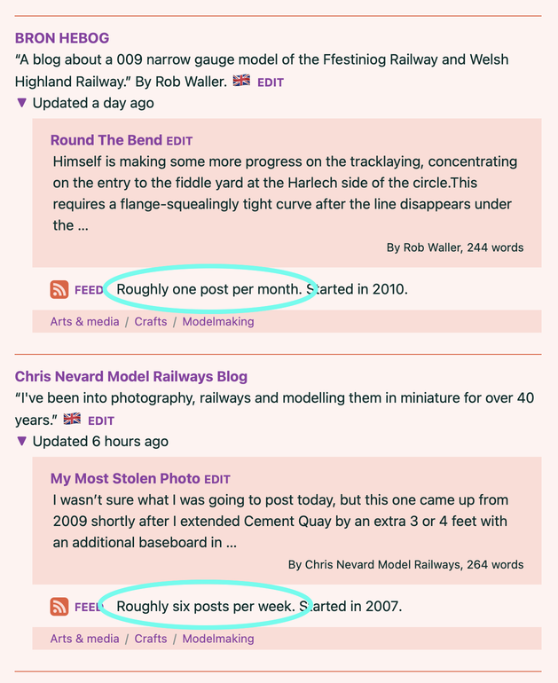
To start with, when browsing blogs, you can see an indication of how often they update, highlighted in this screenshot:

These phrases are based on highly advanced algorithms and heuristics, otherwise known as “trying out some simple sums and seeing if it looks right”.
For each blog we calculate a few frequencies over different periods of time, depending on how many posts we have data about, and display what seems like the most useful summary. If a blog suddenly starts posting much more frequently, or suddenly stops posting after recently posting a lot, these summaries might be a little off for a while. But we’ll see how it goes.
Incidentally, we’ve removed the average word count from those blog summaries shown above. Because that count was based on the content of blogs’ feeds, many of which don’t include the full blog posts, too many of the averages were far too low to be useful.
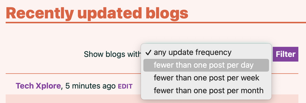
And then, on the Recently updated blogs page, it’s now possible to hide all the frequently-updated blogs. You can filter the listing to only show the quieter blogs – those that only update less than once per day, week or month. Here’s a screenshot:

Does this make sense? Are these useful distinctions? Should there be more or fewer options? If you have better suggestions, do let us know. But hopefully this will help you find recent posts from blogs that don’t pump out updates every hour.
(We’re also wondering if some of the most frequently-updated blogs we currently list are closer to “news” sites than “blogs”, and maybe we should remove them from the directory entirely. But that’s a post for another day.)
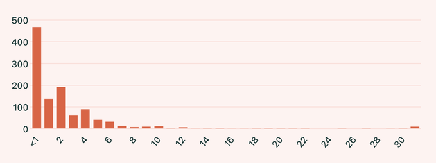
Finally, the Charts page now includes a bar chart showing the distribution of posting frequency, allowing us to see how many blogs post less than once a month, once a month, twice a month, etc. Here’s a static screenshot for posterity:

If you have any suggestions for how to improve any of that, or other useful things to do with this kind of data, do let us know on Mastodon, via email or, if you must, Twitter.